Branding
Fortuna Pixel
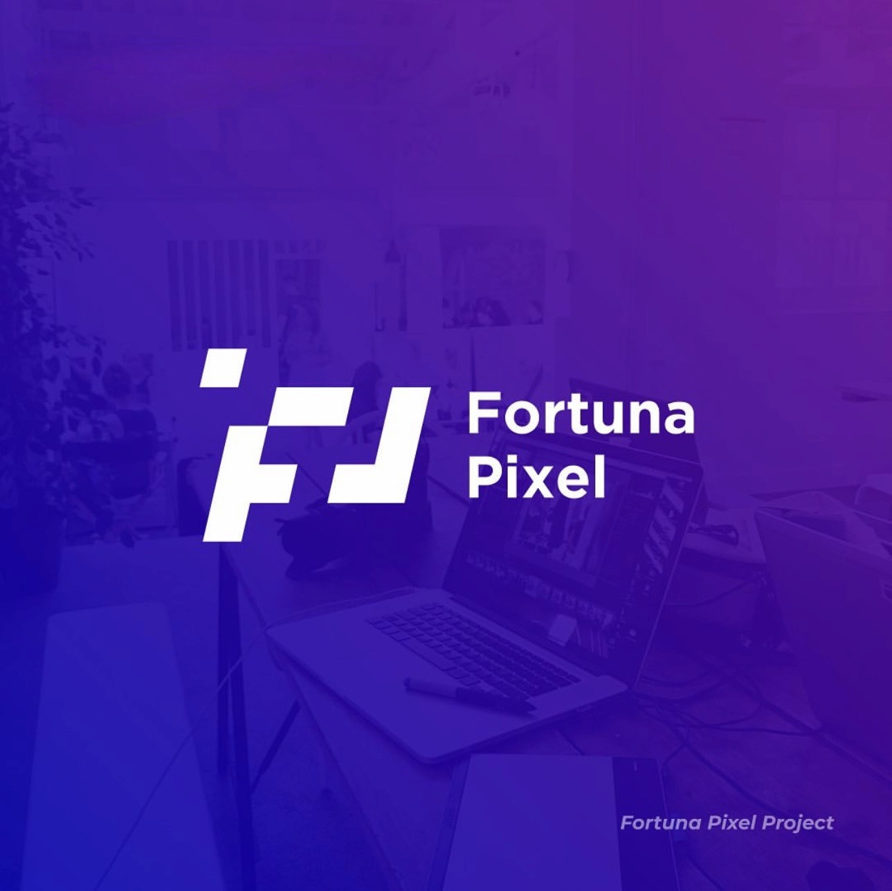
A complete brand identity featuring a bold logo, a warm and confident color palette, and a clean app design — all built around a cohesive visual system that gives Fortuna Pixel a strong, recognizable presence across every platform.
Year :
2025
Industry :
Marketing Company
Client :
Fortuna Pixel
Project Duration :
6 months
Problem :
Many businesses struggle to present themselves in a way that feels polished and consistent. Without a clear visual identity, it's hard to stand out — logos look generic, colors don't match, and the overall brand feels put together in a rush.
Fortuna Pixel needed a complete brand identity built from the ground up — one that would work across every touchpoint, from a logo people remember to a full website experience that feels cohesive and professional.
Solution :
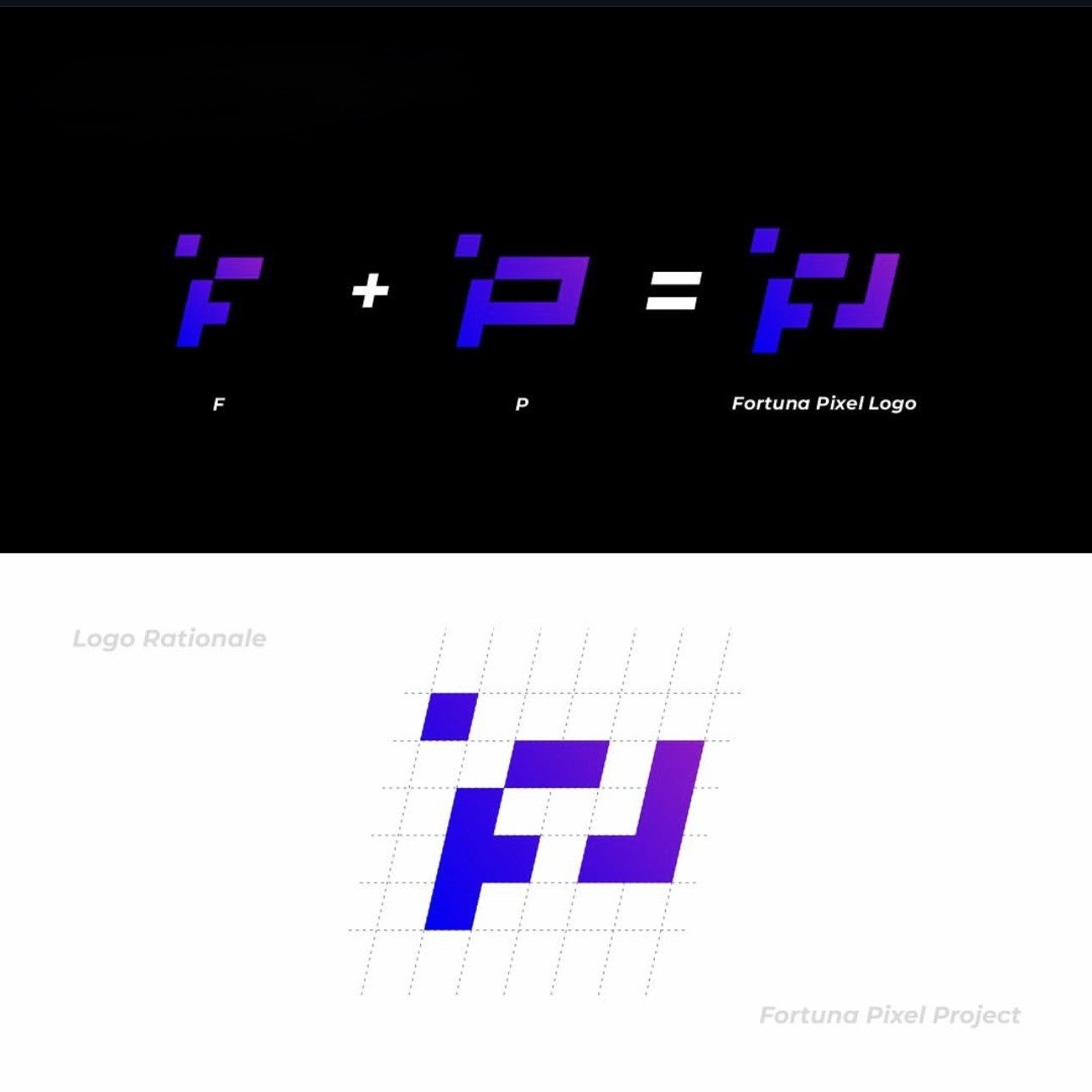
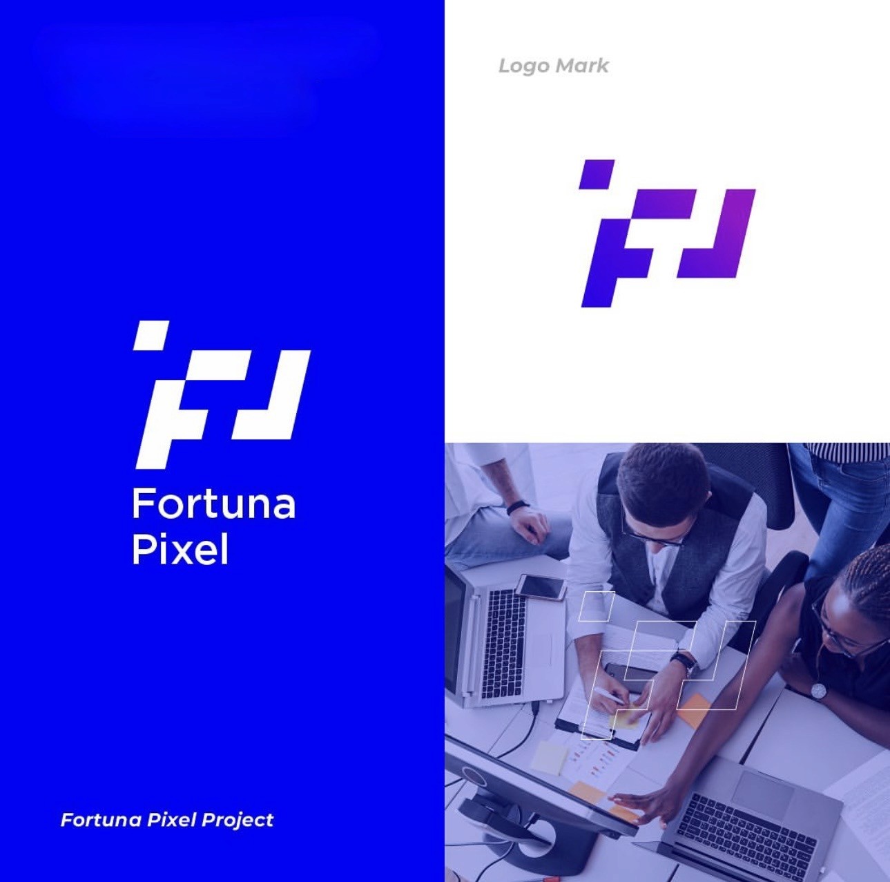
A full branding package was created for Fortuna Pixel — starting with a logo that captures the company's identity, then building out a complete visual system including colors, typography, and design guidelines that carry through every platform.
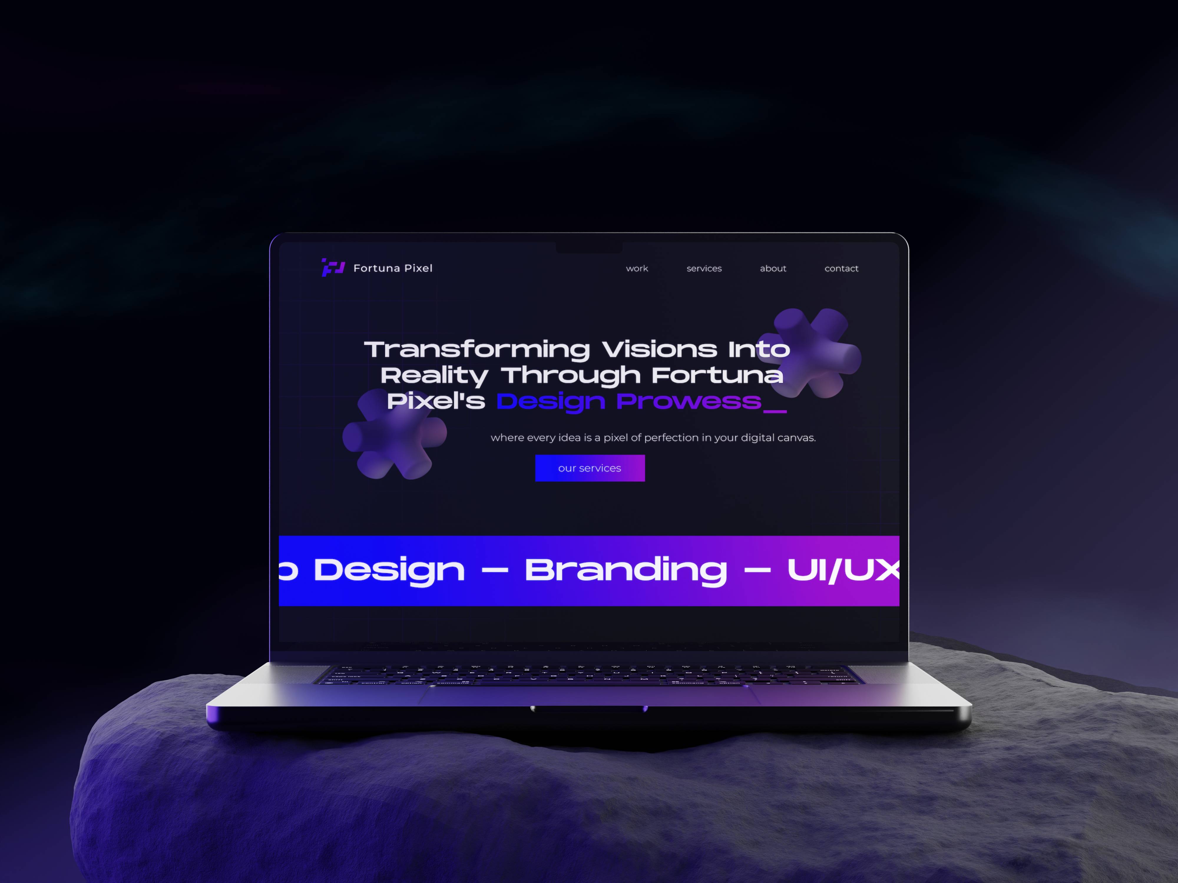
The website design was developed as part of this same system, making sure the digital experience felt like a natural extension of the brand — not a separate product. Everything, from the logo to the last screen of the app, tells the same story.
Challenge :
Creating a brand from scratch means every decision matters — the logo has to work small and large, in color and in black and white, on screen and in print. Getting that foundation right before moving into the app design was key, since everything else builds on top of it.
The challenge was making sure the brand felt distinct and ownable, while still being flexible enough to grow with the company. It needed to look great today and still make sense years from now.
Summary :
Fortuna Pixel now has a brand identity that works everywhere — a strong logo, a clear visual language, and a website that brings it all together. Every piece feels intentional and connected, giving the company a professional presence it can build on.
This project shows how starting with a solid brand foundation makes everything else easier. When the logo, the colors, and the design all speak the same language, the result is something that looks and feels exactly right.
Branding
Fortuna Pixel
A complete brand identity featuring a bold logo, a warm and confident color palette, and a clean app design — all built around a cohesive visual system that gives Fortuna Pixel a strong, recognizable presence across every platform.
Year :
2025
Industry :
Marketing Company
Client :
Fortuna Pixel
Project Duration :
6 months
Problem :
Many businesses struggle to present themselves in a way that feels polished and consistent. Without a clear visual identity, it's hard to stand out — logos look generic, colors don't match, and the overall brand feels put together in a rush.
Fortuna Pixel needed a complete brand identity built from the ground up — one that would work across every touchpoint, from a logo people remember to a full website experience that feels cohesive and professional.
Solution :
A full branding package was created for Fortuna Pixel — starting with a logo that captures the company's identity, then building out a complete visual system including colors, typography, and design guidelines that carry through every platform.
The website design was developed as part of this same system, making sure the digital experience felt like a natural extension of the brand — not a separate product. Everything, from the logo to the last screen of the app, tells the same story.
Challenge :
Creating a brand from scratch means every decision matters — the logo has to work small and large, in color and in black and white, on screen and in print. Getting that foundation right before moving into the app design was key, since everything else builds on top of it.
The challenge was making sure the brand felt distinct and ownable, while still being flexible enough to grow with the company. It needed to look great today and still make sense years from now.
Summary :
Fortuna Pixel now has a brand identity that works everywhere — a strong logo, a clear visual language, and a website that brings it all together. Every piece feels intentional and connected, giving the company a professional presence it can build on.
This project shows how starting with a solid brand foundation makes everything else easier. When the logo, the colors, and the design all speak the same language, the result is something that looks and feels exactly right.